Designing Kata Studio Interaction & Interface Design
Kata Studio is a multichannel chatting dashboard that provides a delightful conversational SaaS experience.
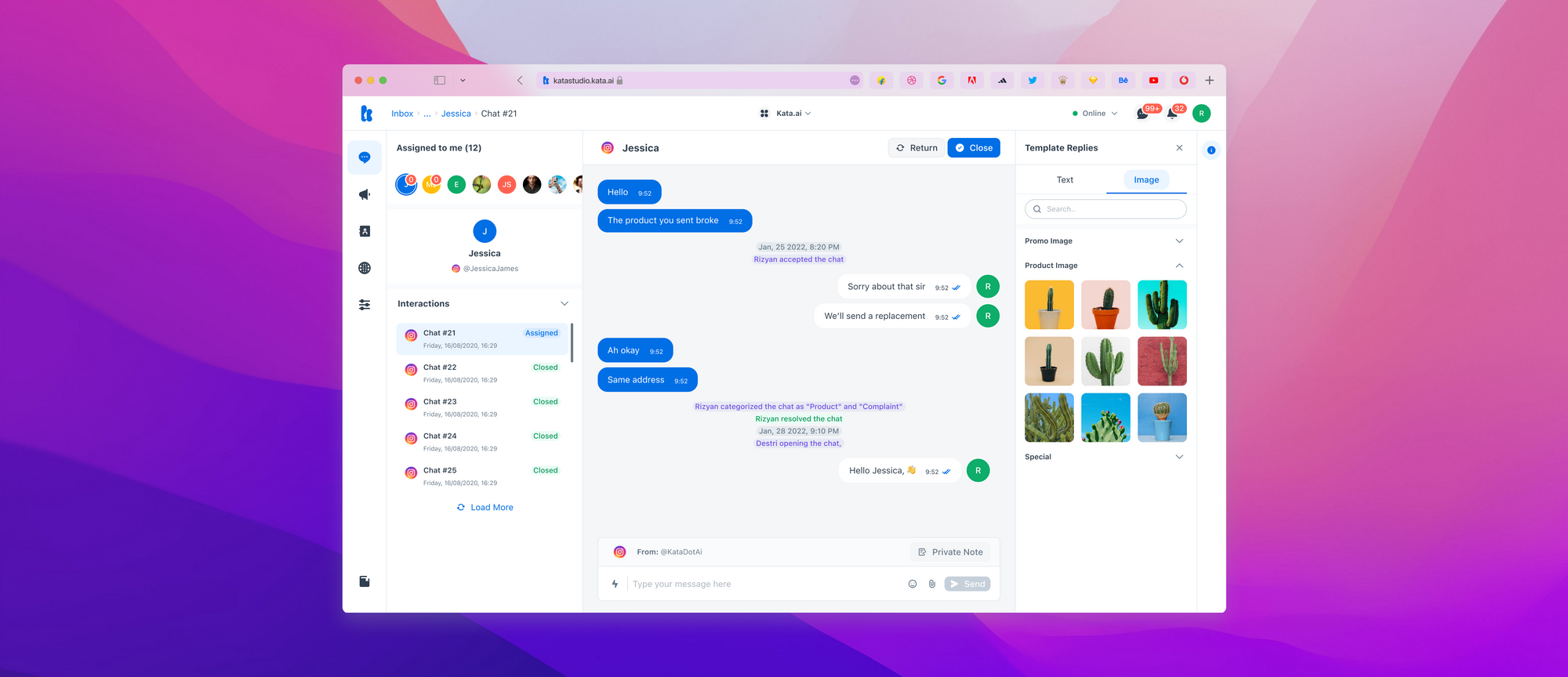
Background
Kata.ai is an Indonesian AI company that empowers brands and enterprises to build their intelligent chatbot. In 2020 Kata.ai built a Business Dashboard and Kata Omnichat. The Business Dashboard is a platform to manage WhatsApp business API easily, and The Kata Omnichat is a platform to manage all conversations in a single dashboard.
Kata.ai has the vision to be the most personalized OS for 100K businesses by 2023. Therefore, In 2021 the Product Design team initiated a unified platform to make all the current products into a single dashboard that we named The Kata Studio.
Highlights of my role
- I was the PIC of Aksara Design System and alignment the Design system things for Kata Studio necessary.
- Responsible to establish the principle of interface and interaction design.
- I conducted research on the interface and interaction design with similar platforms and made The Kata Studio interface and interaction design intuitive, clear, and straightforward.
The problems
We have multiple products that have disintegrated all the time. Imagine if business users want to do some purposes, such as handling CS messages, broadcasting, and automating things, they have to have multiple credentials for each disintegrated product.
The challenges
The Kata.ai products such as Business Dashboard and Kata Omnichat are developed. The challenge is how Kata Studio provides all-in-one tools to manage business interactions. Then reduce set-up time with self-service and makes it easy to understand customers' cross-channel contact management for better CX.
The Goals
Our initial approach was to create a strong foundation for multichannel chatting. Our high levels goals were to:
- The platform provides a seamless self-sign-up flow so most businesses can register and pay independently.
- Migrate and refine experience the Business Dashboard
- Delightful conversational SaaS experience
- Automated payment.
Buyer Persona
Micro business owner
- Micro
- Feature-based to solve narrow problems (e.g auto-reply)
- Low resources and managing repetitive tasks
- High enthusiasm for our ideas
- low willing to pay
CX specialist
- Small-Medium
- Optimizing the whole CS department process
- Different dashboards to manage customer interactions
- May not be the main decision-maker |
Medium business owner
- Medium
- Optimizing multi-division process
- Scattered data points. Translating data into insights
- Skeptic, but can be excited once they experience value |
Direct Competitor

The Interaction and UI Design
Layouting
We try to adopt Jakob's Law, in which the users spend most of their time on other sites. This means users prefer the site to work the same way as the other sites they already know. On the other hand, if we steer our direct competitors, they mostly use the dashboard layout model on their platform.
The users spend most of their time on other sites. This means that users prefer the site to work the same way as all the other sites they already know - Jakob's Law.
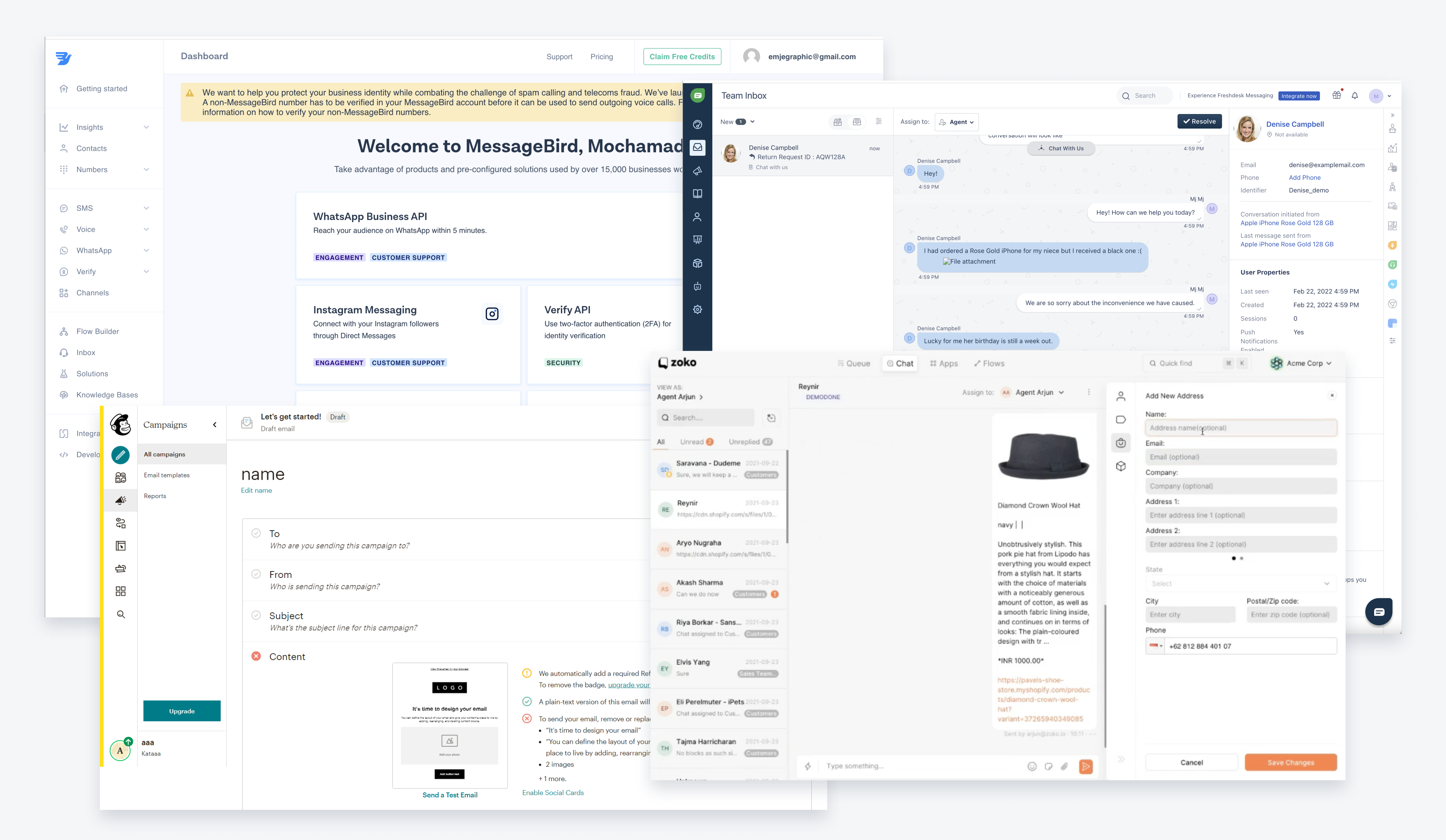
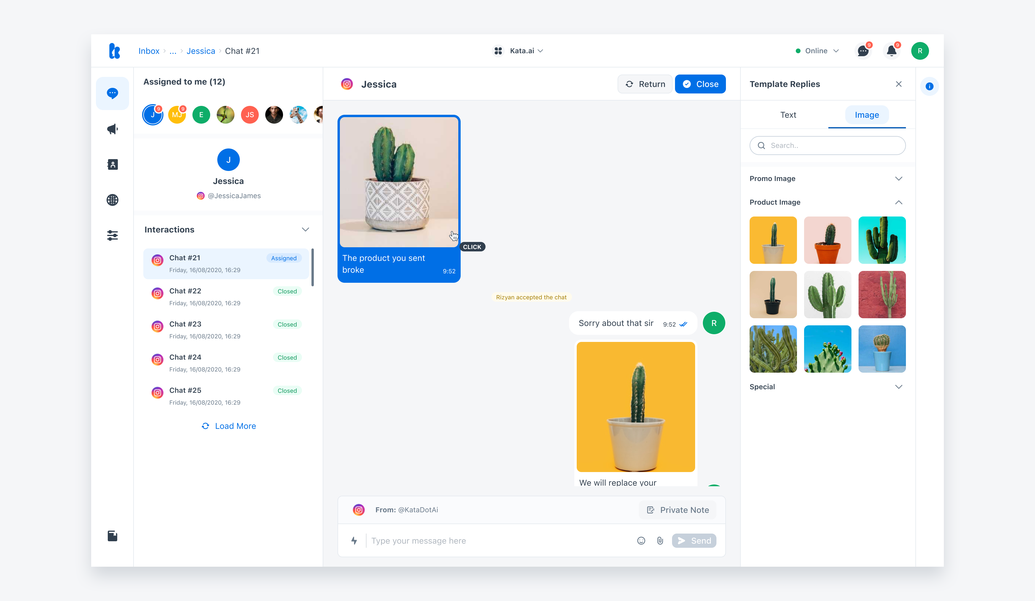
Jakob's Law is beneficial for the user transfer expectations they have built around one familiar product. By leveraging mental models, we can create a great user experience in which users can focus on their tasks and lower the learning curve.
Displaying the data set
We had a lot of discussions about how we display the data sets. There is a lot of data in a SaaS conversation, and this is a big challenge for us to display the data in a clear, straightforward, and intuitive way. We found many similar platforms for the sample on the Inbox page, and they only show customer chat data and the agent task on one page. The advantage is that the agent can move to another chat quickly, but the disadvantage is that when the incoming data is in the thousands, the screen is very crowded, and the agent unfocuses on his task.
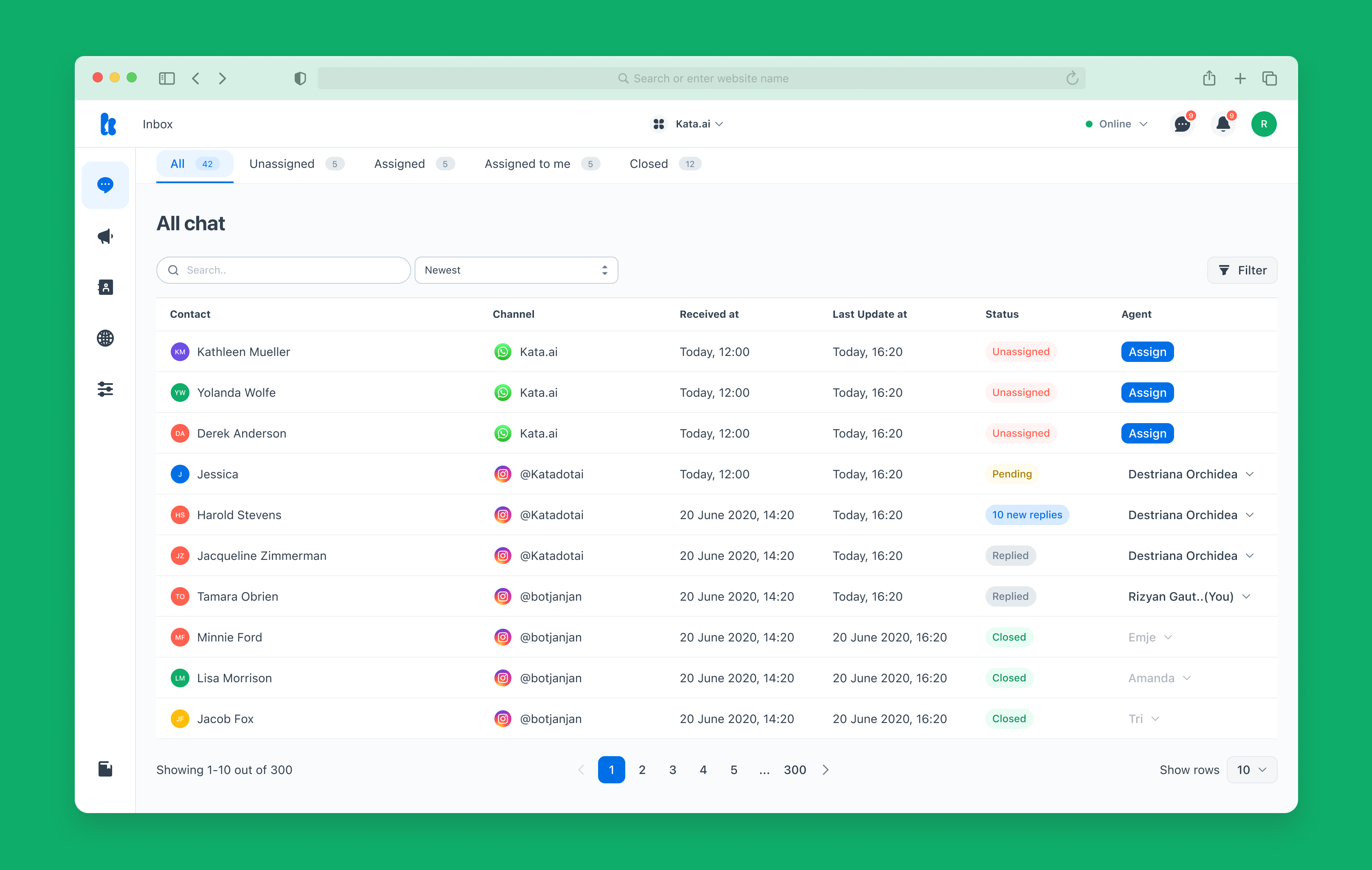
We decided to make 2 level pages between the customer chat data and the agent task. We were trying to cover when the incoming chat is in the thousand; the level one agent focuses on who the customer chatting should be a reply, and level 2 focuses on what the replies don't the customers.
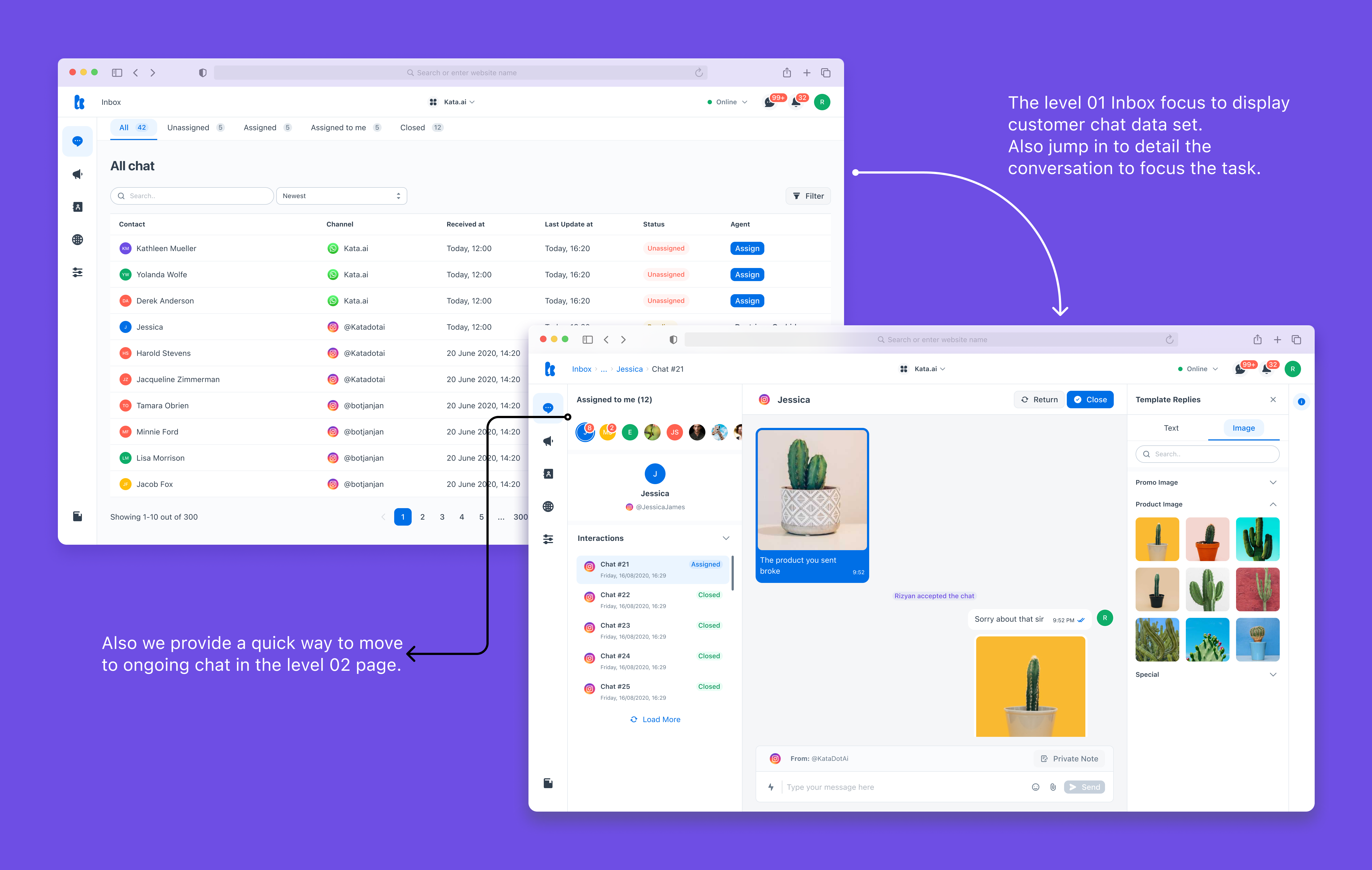
And another matter decision is the data set to display not using table components. We have a resource list component to display data sets. Yes, the visual style is similar to the table. The reason we are using the resource list is that our roadmap, the Kata Studio supports Responsive Web Design. It means if the customers open the app via mobile or tablet project, the data sets display can follow responsively.
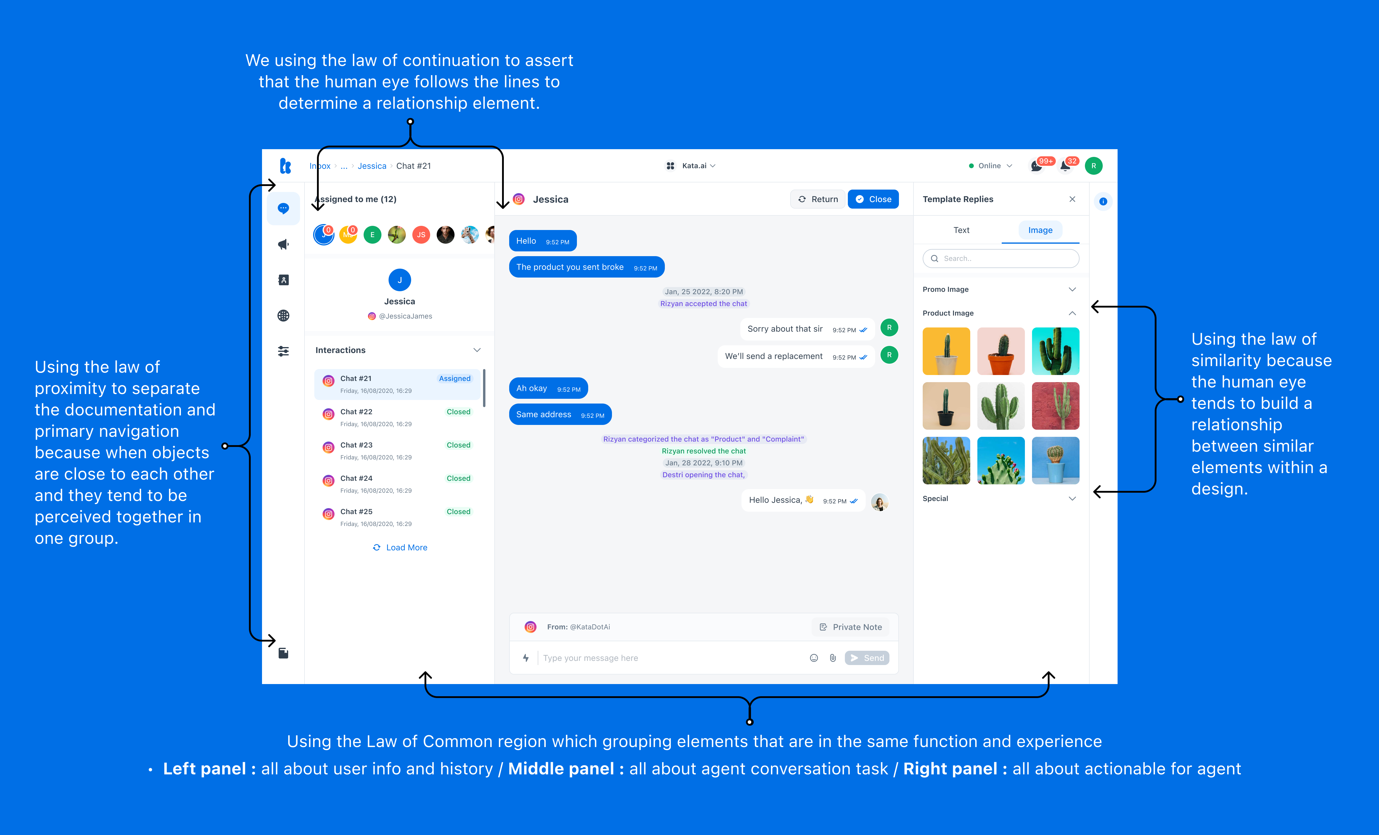
Using the UX law
The fundamentals of UX law are very helpful when designing Kata Studio refers to human perception and behavior. Therefore, we are trying to adapt the Gestalt Theory and Jakob's Law when designing the Kata Studio interface and interactive UI.
The UI component
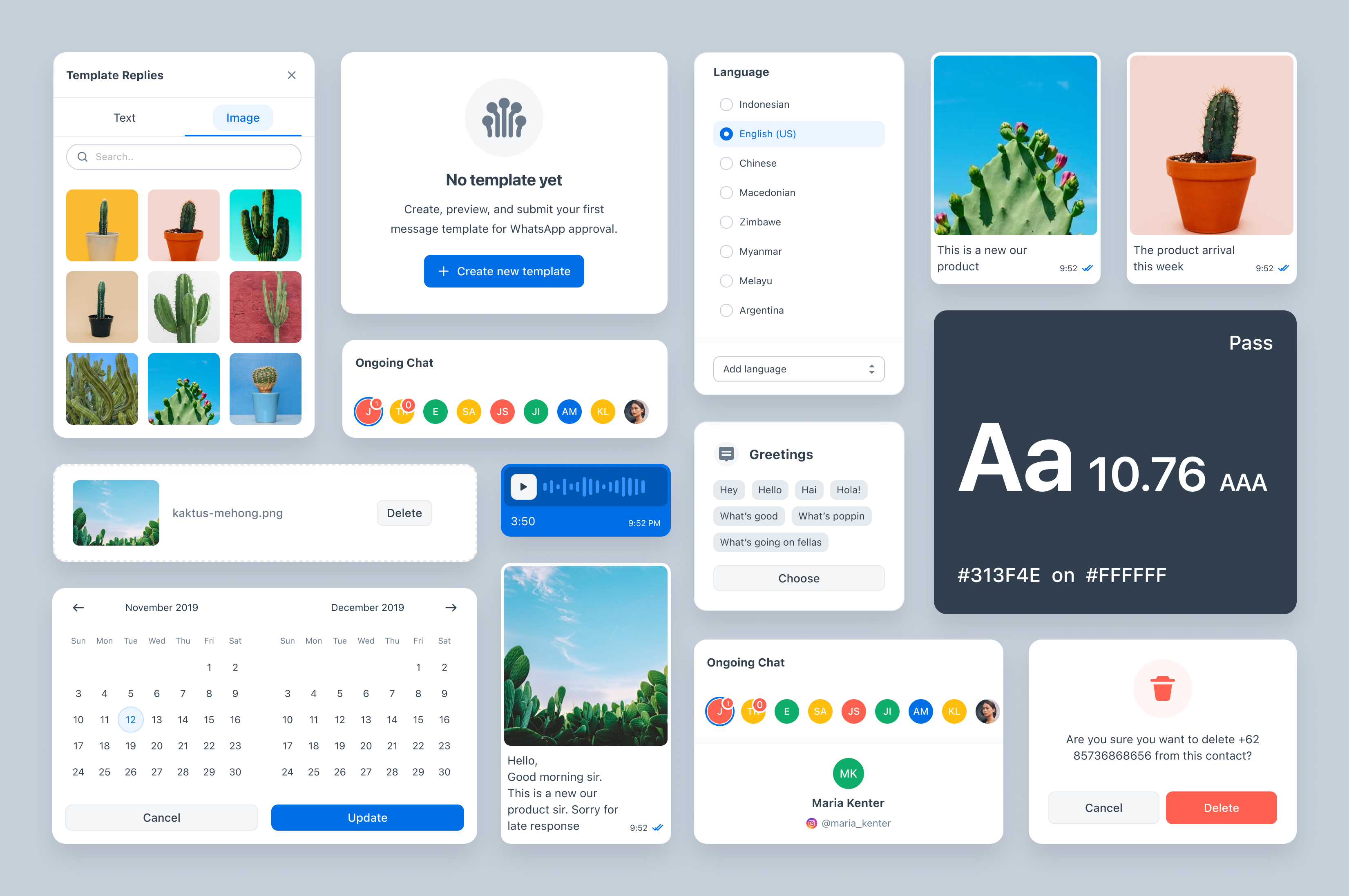
The Kata Studio UI component and foundation using the Aksara Design System. This way is beneficial for the designer and engineer to design and implement. Because we had a culture workflow and common language between designers and engineers.
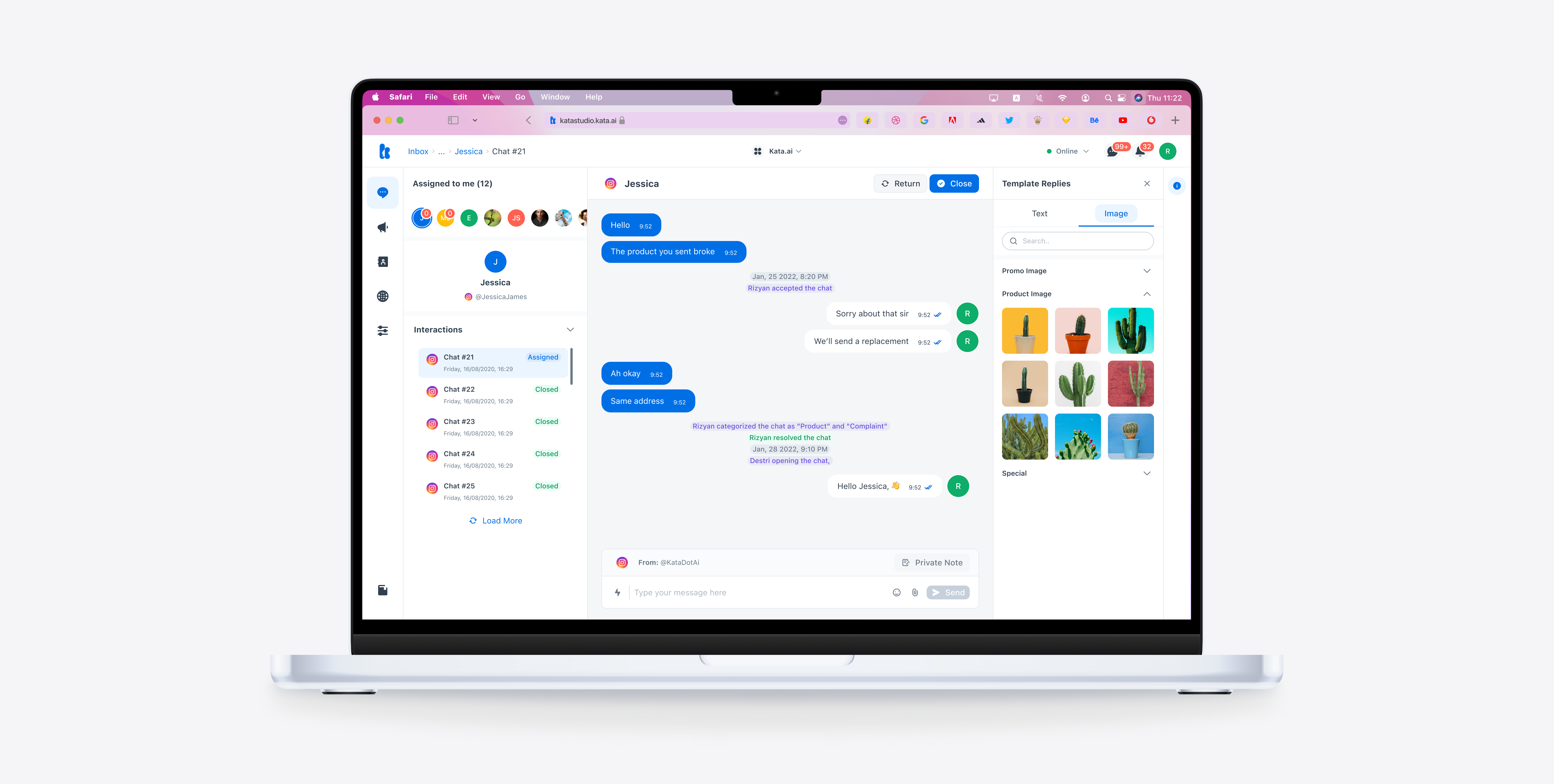
Interface Design Overview

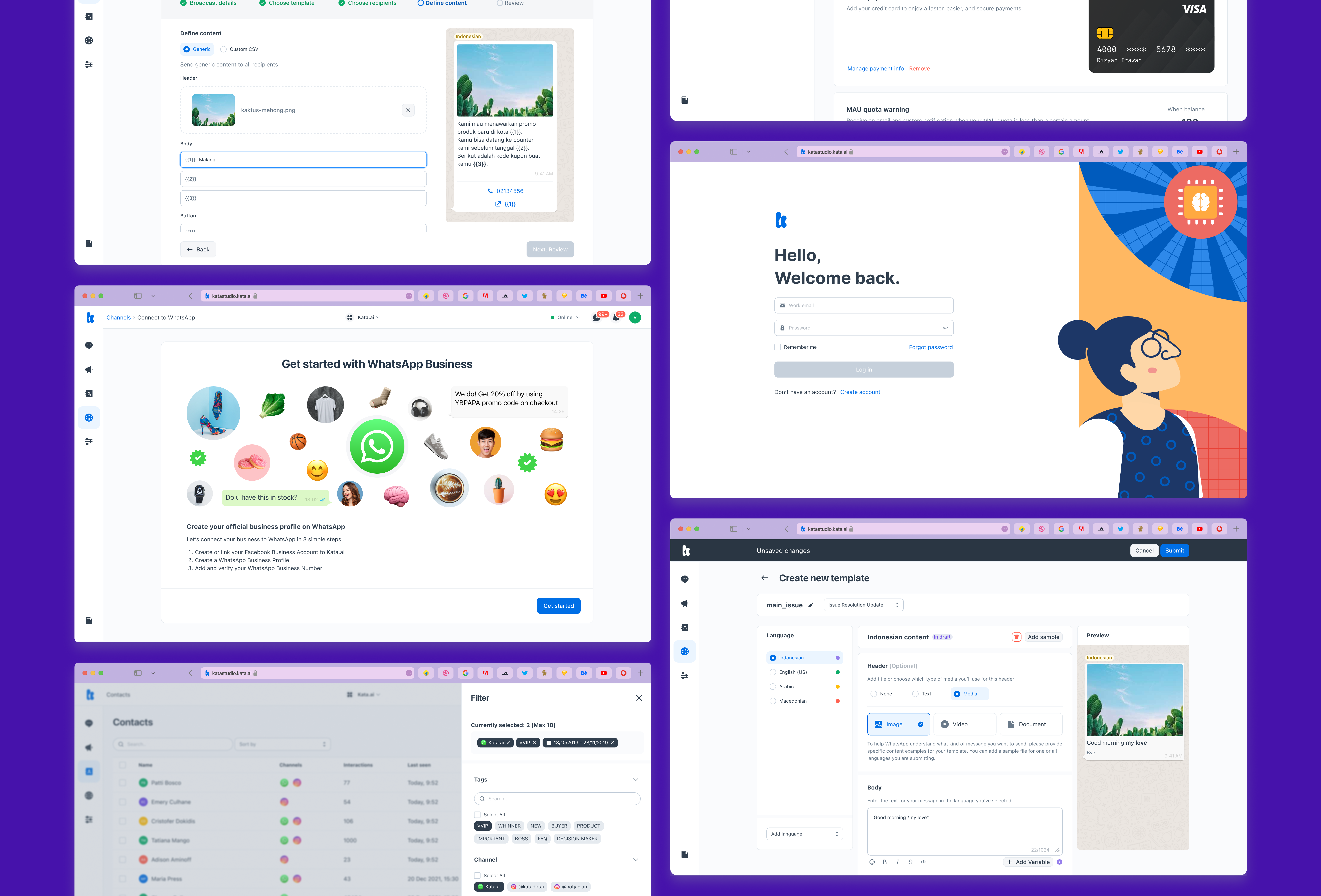
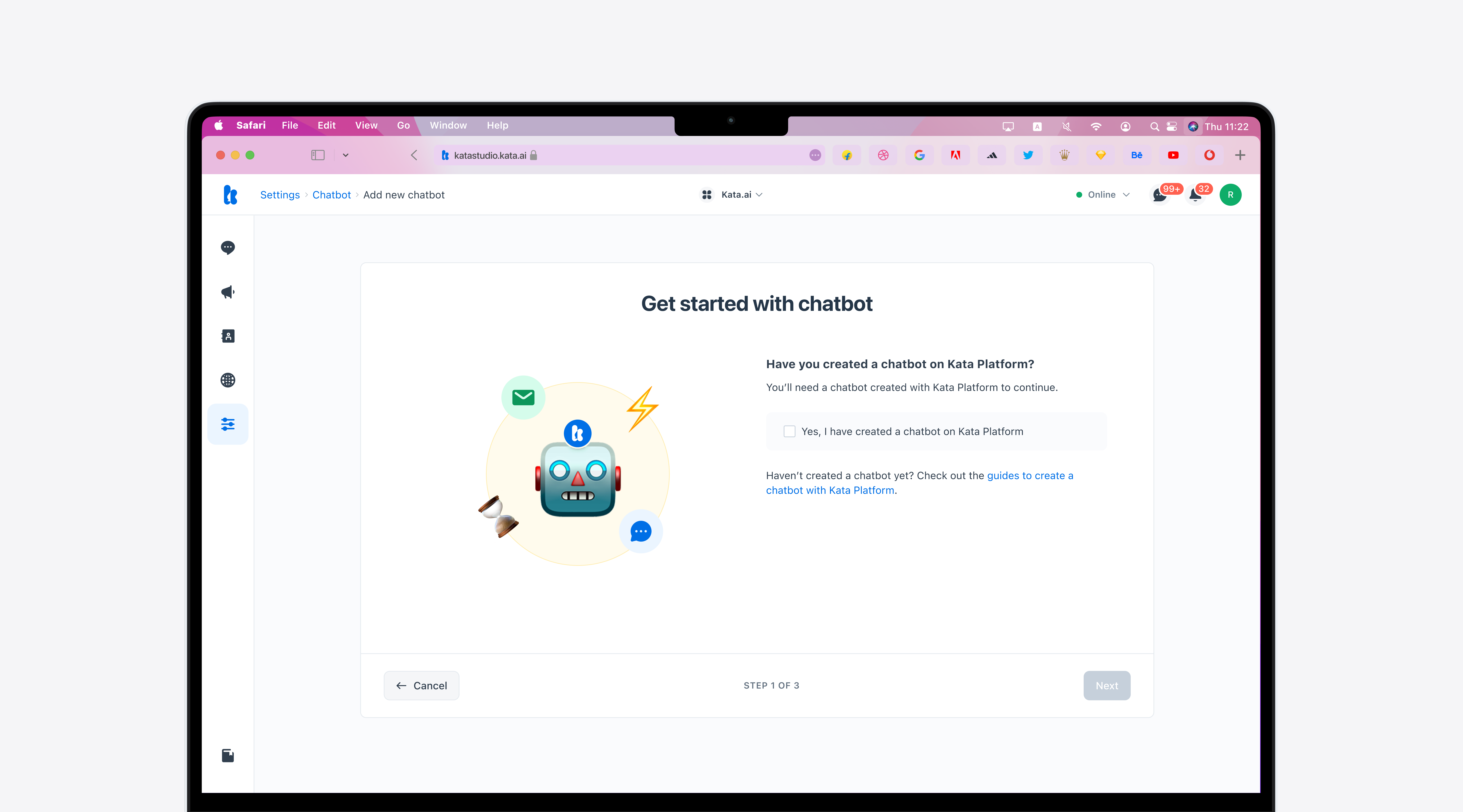
Usability Testing.
After we created the high-fi prototype, we tested it through Maze.
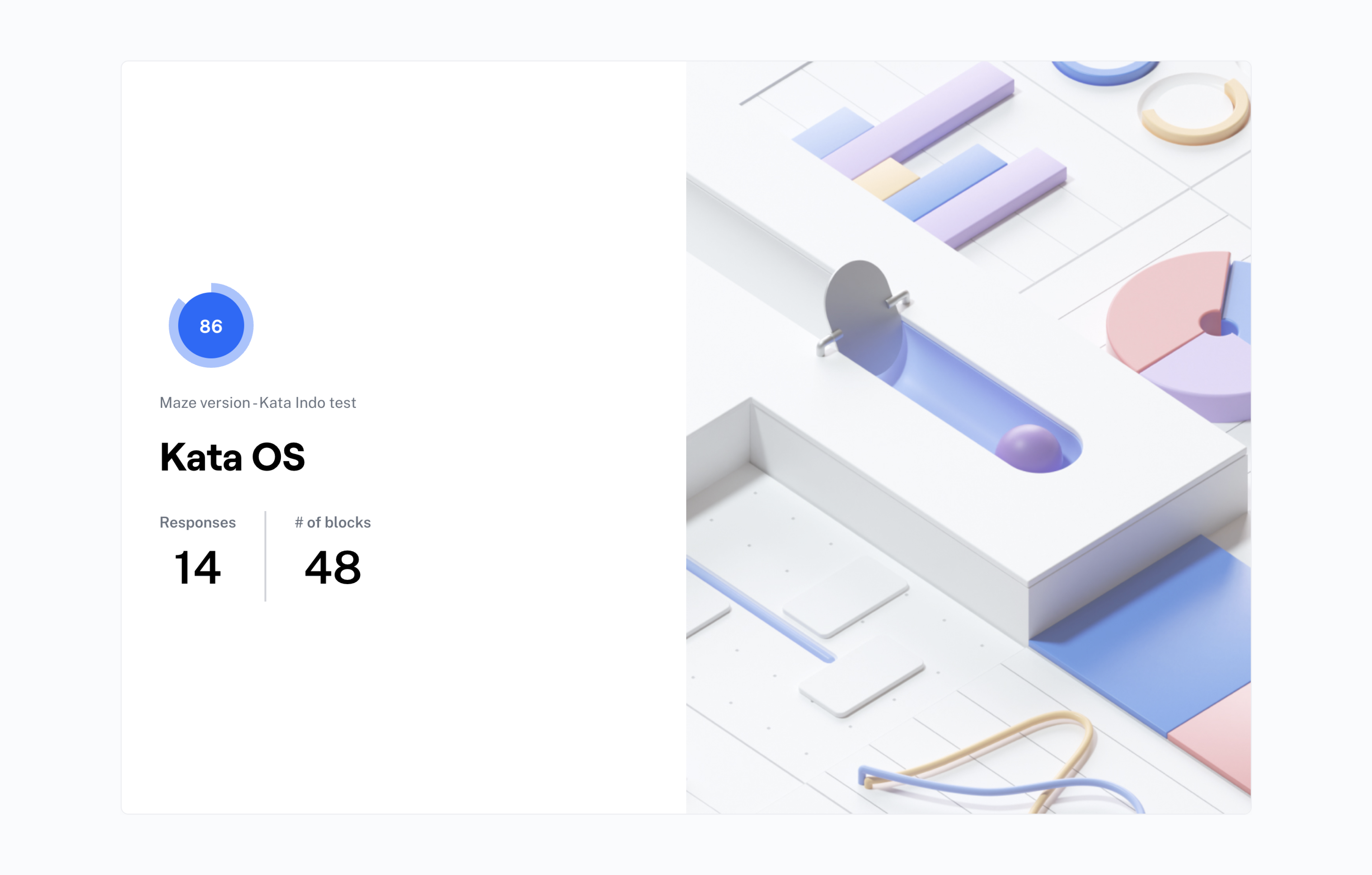
The score is pretty good, but we need to make some adjustments based on the user feedback:
- Users requested more data/information on the dashboard analytics.
- The color and font size on the secondary button need to be adjusted to make it clear for the user.
- Need the accessible action button when scrolling the page because the form content is too long.
- Users requested more data/information on the dashboard analytics.
- The placement of some components (buttons, copy) needs to be adjusted to make it clear for the users.
After the adjustment, we can do a final handover to the developers.
Learnings
This project has been a fantastic learning experience. These are the things I learned when designing Kata Studio Interaction & Design UI:
-
Test and iterate over the concept
We did several iterations on the concept and the interaction UI design before handover to development. We talked with the Product Manager, Product Designer, and Engineers showed the mockups, and confirmed the hypotheses.
-
Collaboration is the key
Make sure your UI design and interactions allow it to be implemented. Talking intensely with engineers makes your designs workable and insightful around technology.
-
Create common language
Common languages are vital for communication. The Aksara Design System significantly impacted our workflow culture. It matters to make your team in one frame.
Special thanks to Rizyan Irawan as Product Manager (as a side job as Product Designer) for providing insights, and feedback, and preparing everything for this project before to go visuals. Also, Mas Tri as our Head of Design always guided and gave me space to explore the interaction and UI design. Evita and Greggy, thanks for helping me create a few page screens and Responsive Web Design. Also, Mbak Destri as The Product Manager too for helped complete sprint 1. And the last, for Kata Studio Dev for realizing the visual to be code. 🙌

