Asphalt Design System, a design system for Gojek's app.
The Asphalt Design System is a custom design language system created by Gojek. It serves as the foundation for consistent and cohesive design across Gojek's products and services.
Principle
Great design principles define quantifies that we can interpret in different ways and ground them in the context of a specific product. Having clarity about the purpose of building a system is paramount because every decision should be shaped by it, even if indirectly.
Consistency
We design with the system in mind and never as individual flows. Our designs are consistent with the best practices and any outliers are avoided.
Usability
We design with users in mind first and business second, keeping it efficient, effective, learnable, and safe.
Accessibility
Accessibility governs our design to ensure inclusivity. We want every section of our users to feel like the app is designed for them without the need to put in extra effort to use it.
Aesthetics
We design products that elevate Gojek as a brand without compromising on the visual aesthetics of our interfaces and interactions.
Design tokens
Spacing

Aloha employs a spacing system based on tokens. We use the same scale for defining space within a component as well as its spacing with the overall screen boundaries. 4px is the base value in the scale. This base token and its various multipliers form the spacing token library. We use these tokens to align our components to the 4px grid while creating mobile designs.
Connection
Elements in a design near to each other are seen as related to each other in a meaningful way. When we add more space between the elements, their perceived relationship weakens.
Hierarchy
Elements with more spacing around them tend to be perceived as higher in importance than those with less space around them. Provide sample surrounding space to the content of high significance to attract focus.
White space
Empty space, also known as white space, is vital in design. White space breaks up sections on a screen to create a visual hierarchy, helping in information processing, or increasing focus on specific elements.
Color & themes
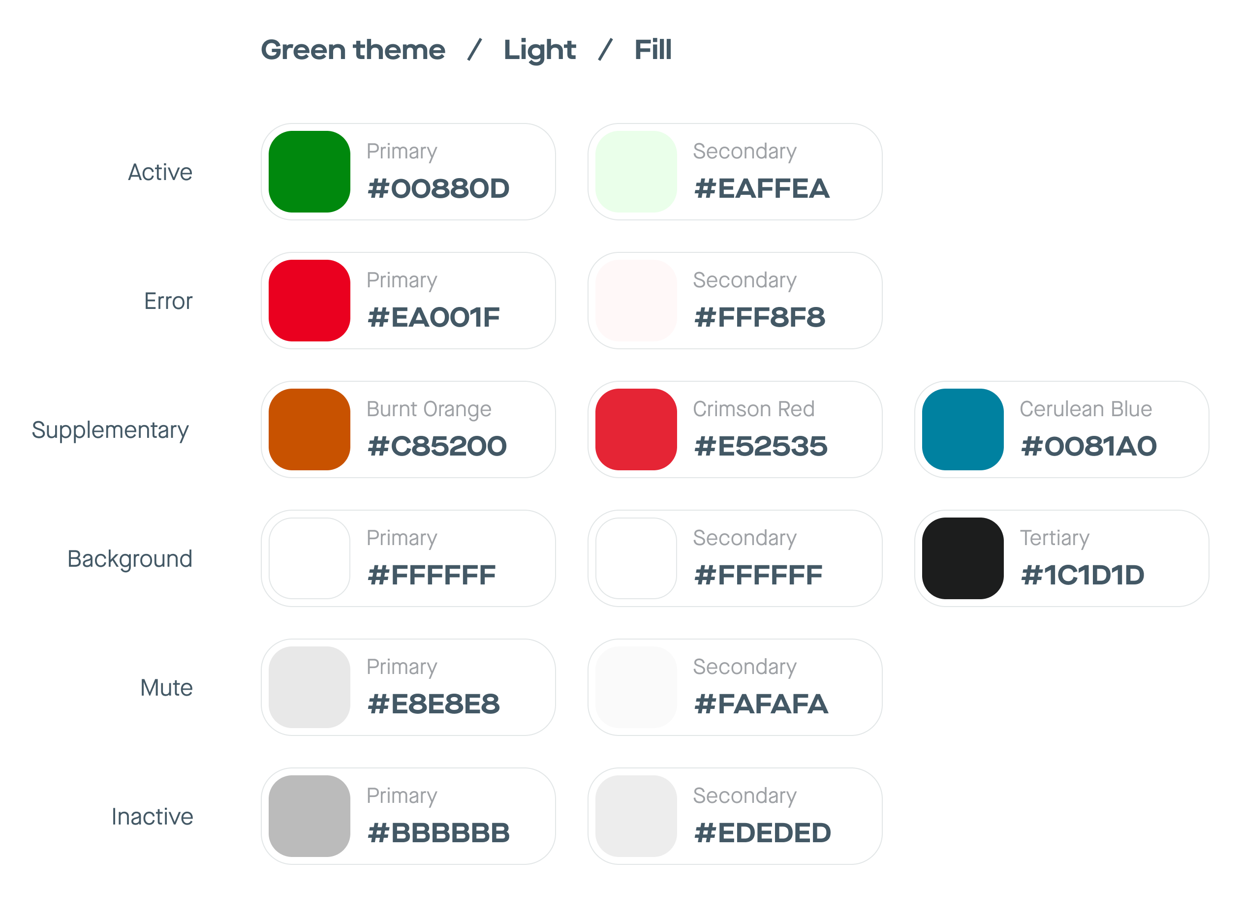
Colors in Aloha have their roots in the product type in Gojek, consisting of three color themes - Green, Pink, and Purple.
The green theme
for our consumer and driver-partner apps
The pink theme
for entertainment services, and.
The purple theme
for merchant-related apps.
The structure helps us build consistency and flexibility to create a new theme for a new app.
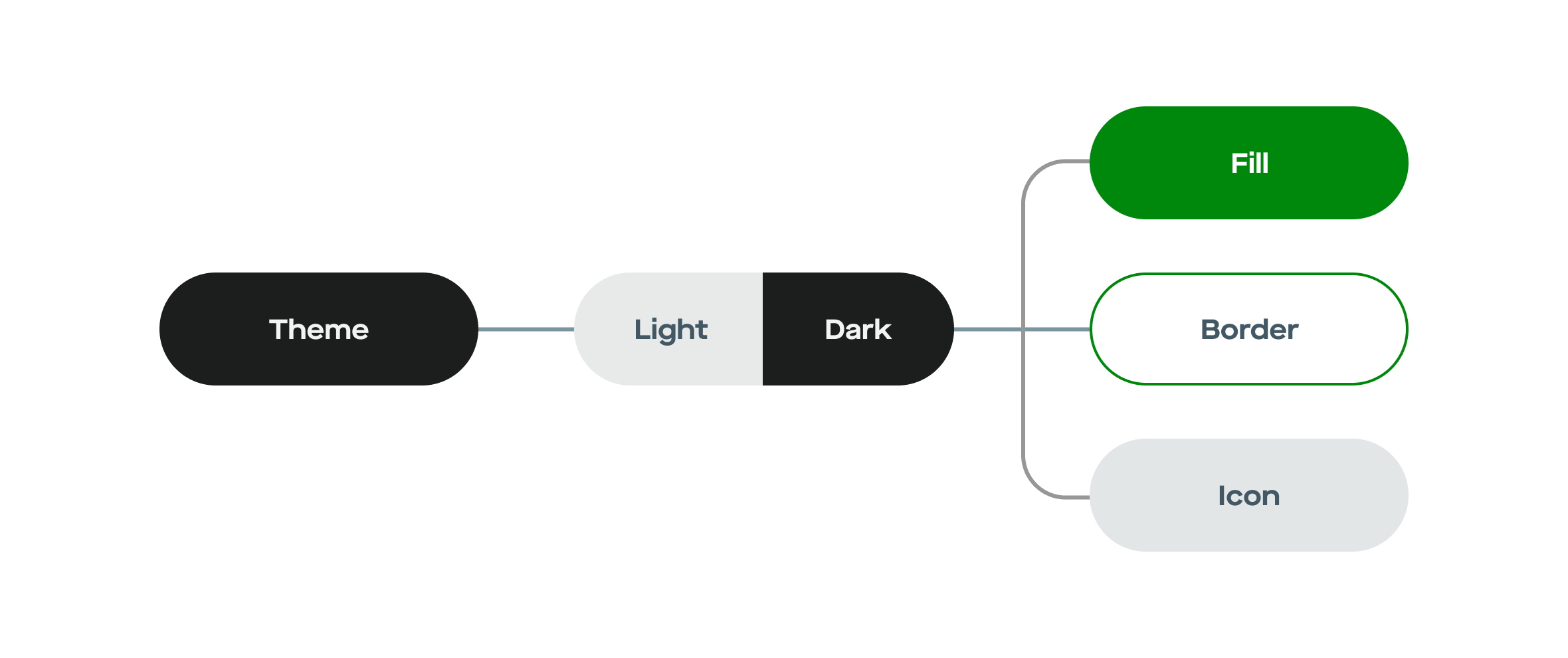
Our primary color system consists of 3 themes (green, Pink, and Purple), within which we have their light and dark versions. The tree branches out further into color styles for specific scenarios like fill, border, and icon.
Typography
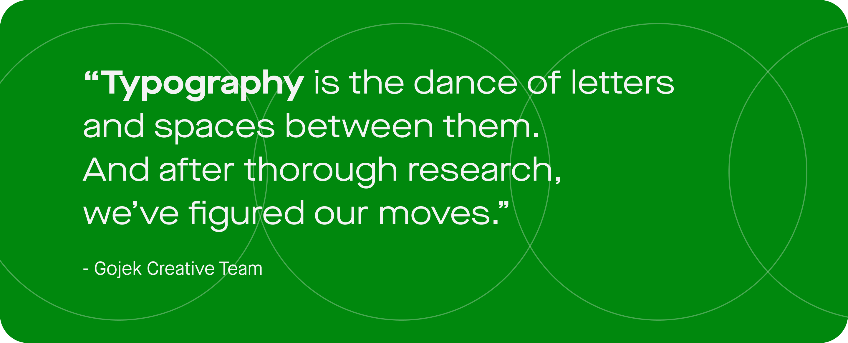
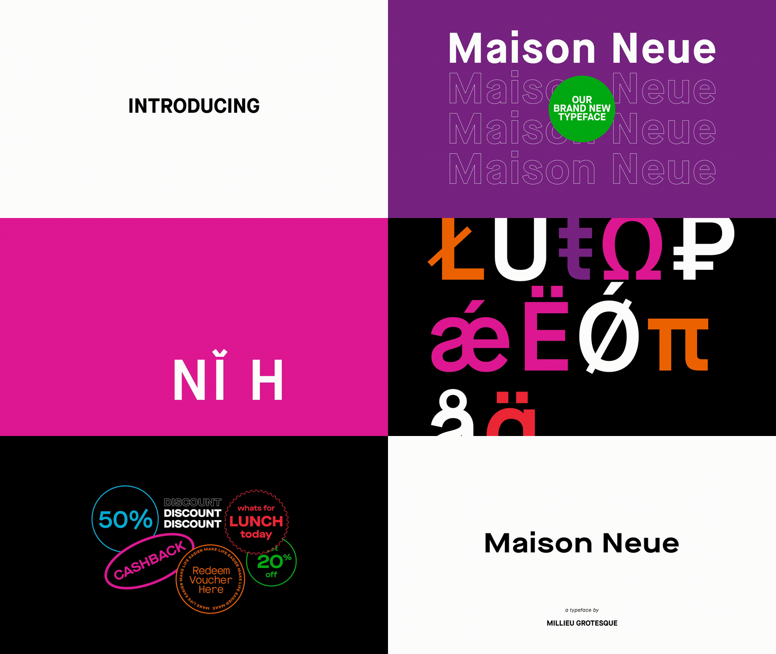
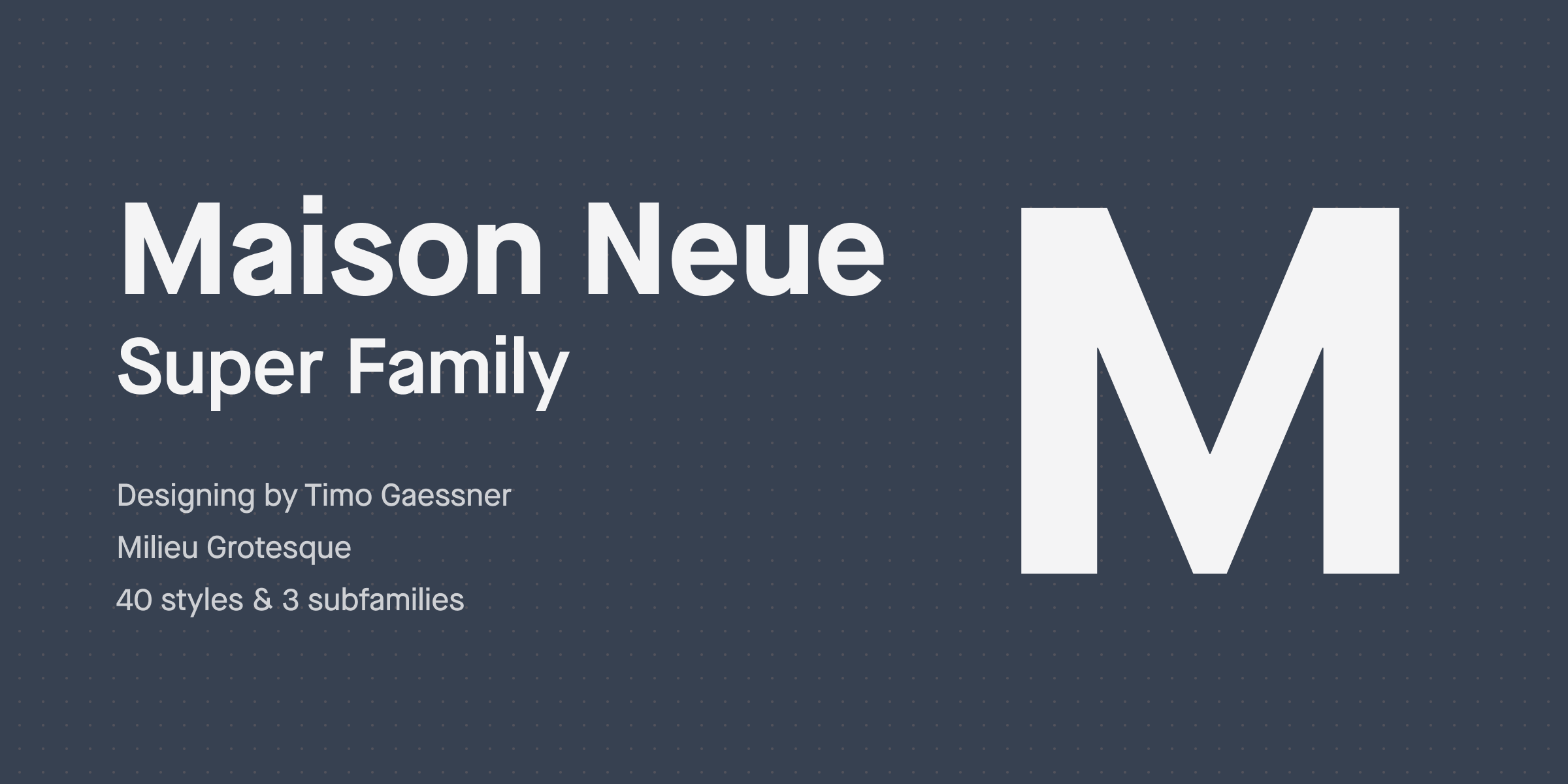
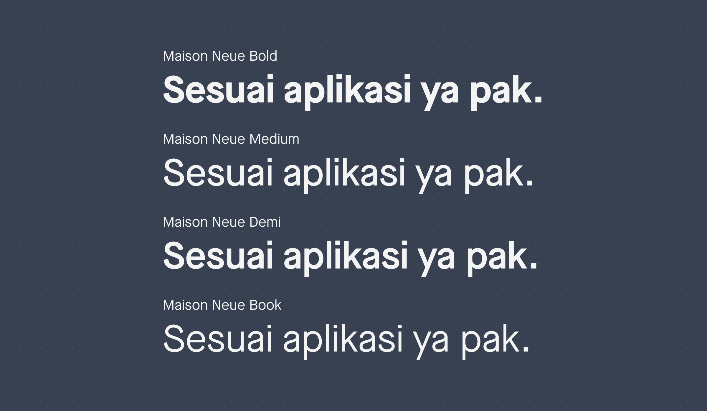
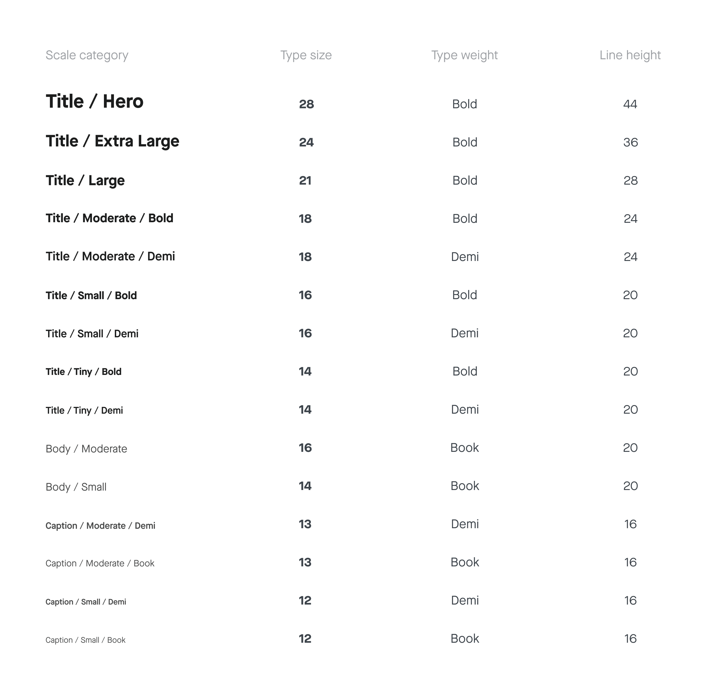
Typefaces can be a touchpoint to subtly convey the right tone and personality throughout our digital experiences. With these factors in mind, we chose the typeface - Maison Neue. Its unique attributes give Gojek a strong brand recall across communication channels. The legible form and character work magic on print and digital alike. And with larger scales, it only gets sassier.
Shadow
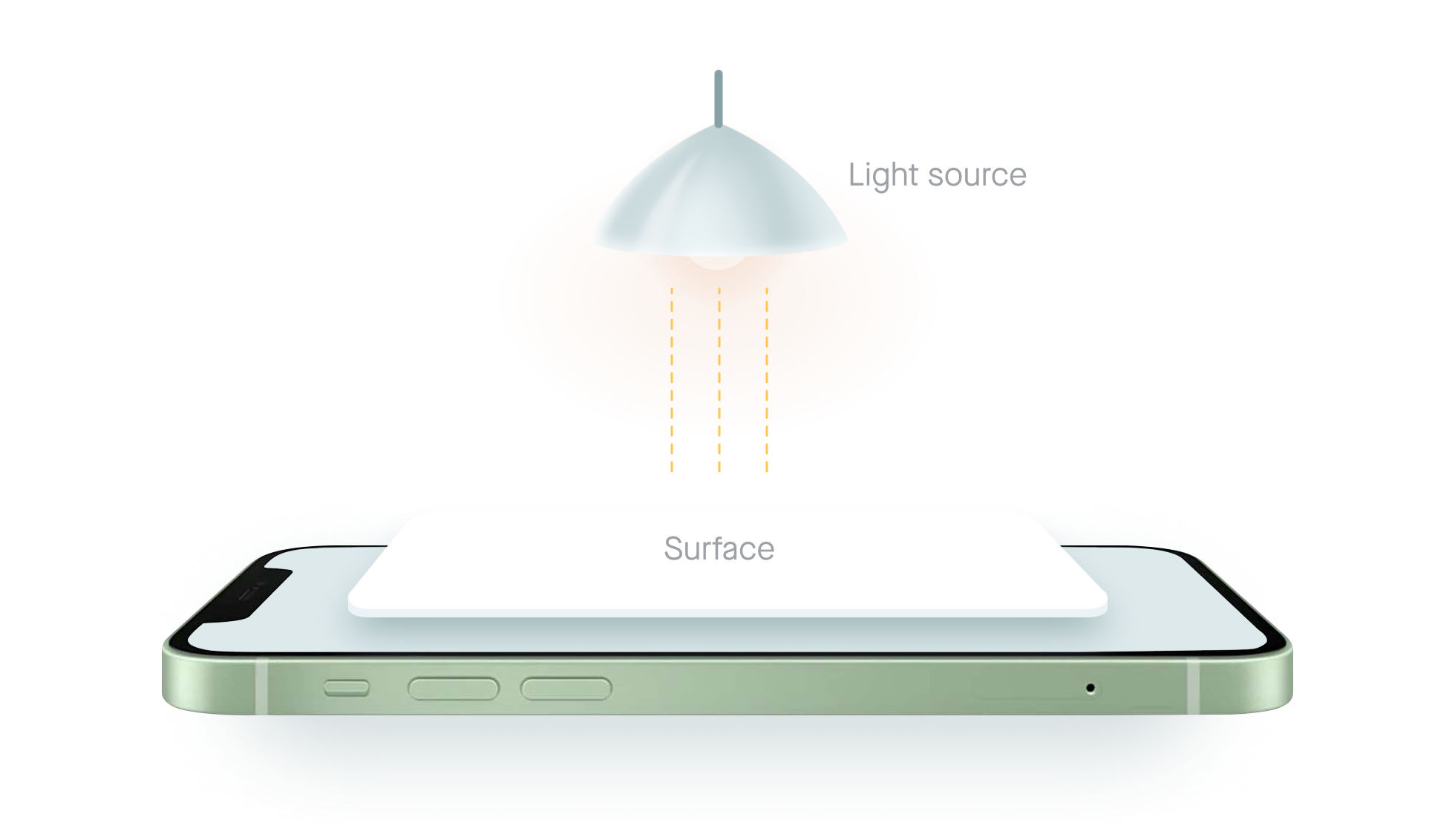
The surface blocking the light source cast a shadow in Aloha. The conceptual light source is always placed perpendicular to the project screen.
Elevation
We measure elevations from the base to the top of a component. It’s the same way the height of mountains is measured, from sea level to the tip of the mountain. All components are 1-pixel ticks. The value of elevation decides the shadow size. In our system, we have two types of elevations.

Component
Master components
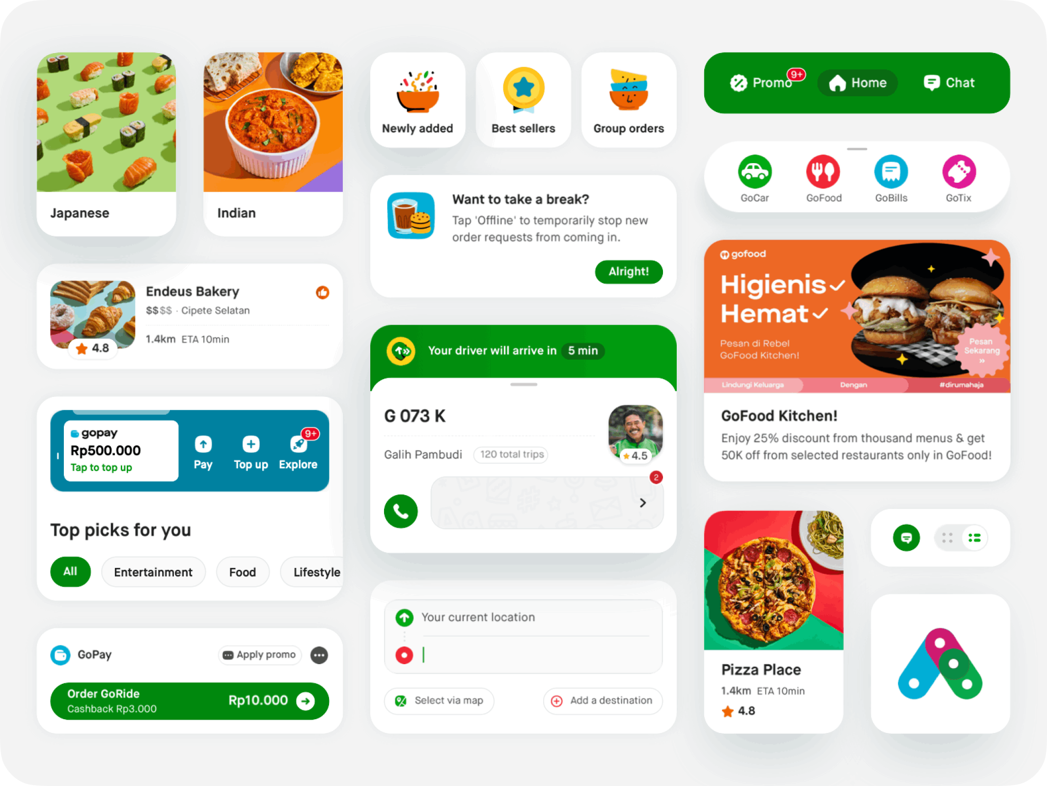
Implementing Brad Forst’s Atomic Design, Aloha Master components are the reusable building blocks specifically created to work together to create familiar and consistent patterns and intuitive user experiences. Each component has its associated interaction, UI needs, state changes, and variants, all with accessibility built into them.

Workshop and common component
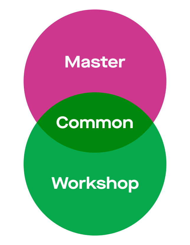
In a large ecosystem, we realized there will always be unique components that a specific feature, product, or app might require for its various use cases. Relying solely on the master component can be a limitation for a designer and the product itself. Therefore, we decided to create a workshop component library that can accommodate those product-specific needs and bring the necessary flexibility to systematic design.
When more than 3 products use a workshop component, we label them as common components. They will then undergo testing in various edge cases to satisfy all the flows where the products may be used it, followed by updating the documentation for the engineering team to build it. The component will then be a master component.
Accessibility
It's essential that Gojek is usable for everyone - "Leave no customer behind."
Everyone is a pretty big group. It includes our customers, our driver partners, our merchants. It also consists of all members of our community who rely on accessible experiences. Baking A11y inside our components is one way to improve accessibility and consistency when building products for the Gojek ecosystem.
Colors and visual cues
We comply with WCAG AA standard contrast ratios. To do this, we choose our primary, secondary, tertiary, and extended icon and product UI colors that support accessibility, ensuring sufficient color contrast between elements so that people with low vision can see and use our products too.
We must not convey or differentiate information only with colors. Instead, use multiple visual cues, such as stroke weight, shape, text, or icons to ensure everyone receives the same information. These elements help people who are unable to or have difficulty distinguishing one color from another, people who are color blind, have low vision, or are blind.
Structure and hierarchy
A consistent and clear hierarchy helps people who navigate the page using assistive technology. Be predictable with structure and use patterns and layouts familiar to people. We try to pay attention to these crucial aspects for every design that is shipped.
- List by the level of importance
- Text scaling
- Components grouping
- Sequencing for screenreader
Component feedback
Using multi-sensory feedback to know what's happening in the screen adds an additional layer of interaction, using a different sense or a variation on a sense. These can offer a more tactile way for users to interact with our app, not only improving the accessibility but also enriching the experience of all users.
- Haptic feedback
- Auditory feedback
- Responsive component
Creative things
Iconography
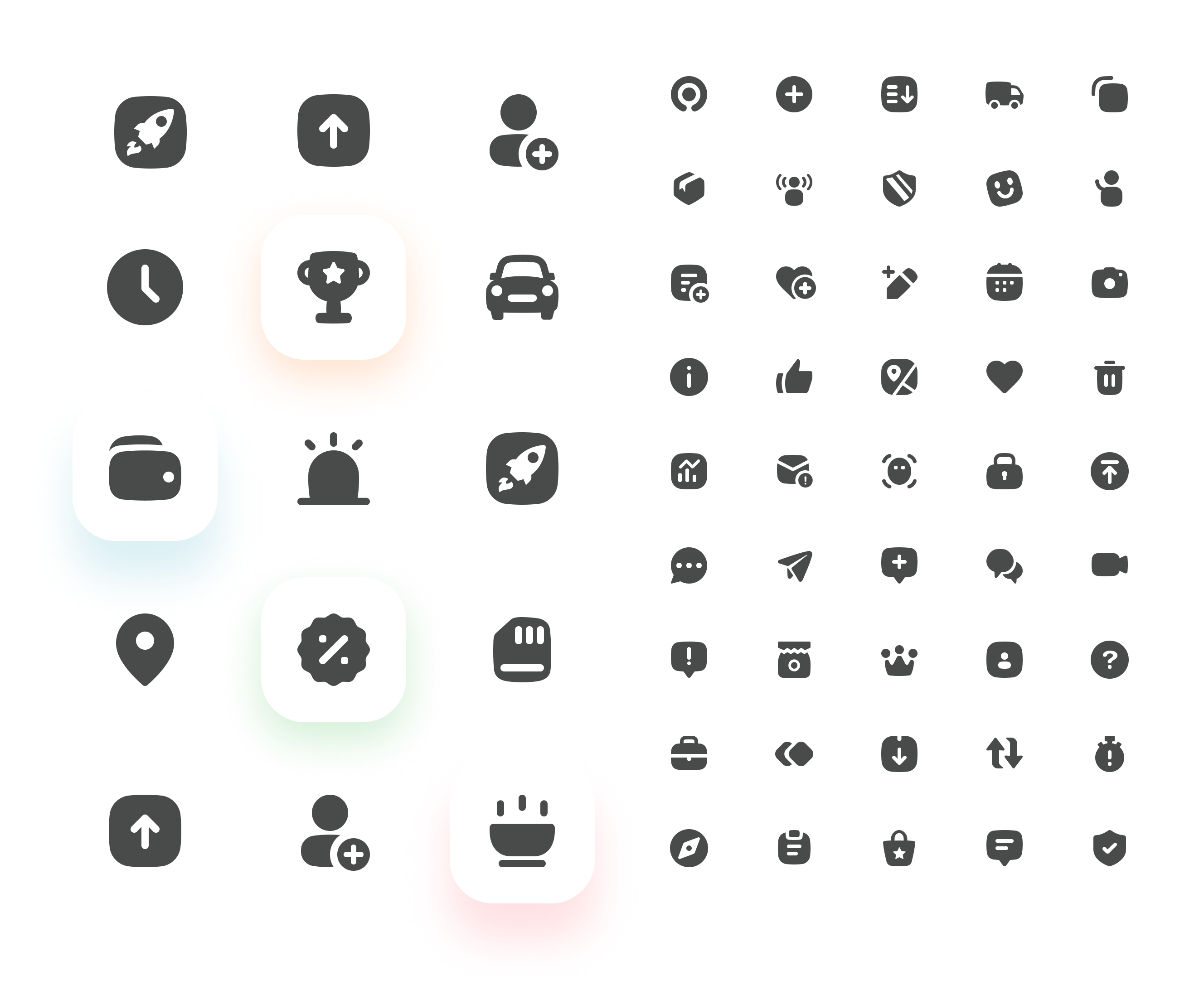
Aloha iconography is accessible, intuitive, and contextual. Inspired by the circular shape of our Gojek logo, "Solv," it gives us a unique visual identity.
Illustration
We believe that every element on the screen is essential. This idea applies to our illustrations too. They speak to the user in their language in a relatable and contextual manner to help them achieve their goals.
Spot Hero

Aloha's largest illustration size. This variant is used in empty states, dialogue cards, or onboarding screens to give the user detailed information to take action in cases where graphical elements play a major role in communication.
Spot

A mid-sized set of illustrations is used to complement the content and provide equal context with the text when space is a constraint.
Mini Spot

The smallest-sized illustrations are similar to the Spot but just mini (literally). These are sometimes used as replacements for icons to give that extra bit of delight in the interface.
Motion Design
Throughout the Gojek ecosystem, we use functional motion design to help solve user experience problems, improve fluidity, and create a cohesive and seamless environment that makes everything easier to use.
Our motion principles educate designers on regulating motion usage and effectively apply the same while designing motion for functional purposes.
Candid
"Having a human touch”
For any design to be objective, it needs to connect with the user emotionally, taking them beyond their imagination, so it feels more relatable to them.
Contextual
“Show don’t tell”
Motion can capture attention and highlight an important piece of data on the screen or critical UI element to be in focus.
Witty / Playful
“Being yourself”
Our motion is expressive and has character. We want the user to feel the joyful moments and at the same time feel connected with our product.