Aksara Design System, A design system for a conversational platform
Aksara is Kata.ai's design system, ensuring product quality and consistency. It includes foundations, voice, and component standards.
Background
Kata.ai has experienced a lot of growth. Our services have thrived into multiple sophisticated products. Along the way, we realized with more features and improvements we made, the inconsistencies in our UI became more apparent. The design process was inefficient, too. It was clear that we needed a proper system to help us maintain consistency and scale our design.
We decided to create our design language system—a single source of truth that our team can adhere to. Design language system helps us create harmony, not only for the design team but for everyone involved in the development of the product. Having a design language system also means focusing more on fine-tuning existing products and delivering delightful experiences to our users.
💡 Aksara /ak·sa·ra/ noun is a visual symbol, usually stamped on paper or other media (stone, wood, leaf, and fabric), to express thoughts and ideas.
We chose the name Aksara because we want our design system to help developers, designers, and all other functions across the organization express their thoughts and ideas into tangible, consistent, and efficient digital products.
My highlight role
- I was responsible as PIC of the Aksara Design System.
- Creating and distributing the Aksara Design System UI Kit to other designers’ needs.
- Collaborating with the engineers to make sure our component is implemented. I
- In not seeing jobs, my significant role in enabling the designers and the engineers to contribute to the Aksara Design System to be scalable and valuable.
Purpose of Aksara
Aksara Design System's primary goals are:
- The faster design process with ready-made UI components & guidelines.
- Faster development process with a well-defined style & code repository.
- Deliver better products with a delightful and consistent user experience.
- Create a workflow culture between the designers and engineers.
The Principle Values
These principles shape how we design all experiences across Kata.ai's products.
Obvious
Our design should be clear and recognizable right away. It should be easy for our users to become familiar with and proficient in Kata products.
Delightful
Translate our brand's values and identity into experiences our users can relate to. Every visual and written content should be able to motivate and create excitement for people to learn and utilize AI technology.
Seamless
Every design component and information has to be as cohesive as possible. This ensures smooth transitions as our users navigate across the interface.
User-Centered
Every design consideration and decision has to be the result of user research to ensure our design meets the needs of our users.
Library Structure
The Aksara Design System provides only the Kata.ai's across products. In addition, we provided a few libraries in Figma. The purpose is to make our workflow culture easy and the component asset easy to use and reusable.
We separate the public interface and the web app interface. So, when the designer wants to create a website or docs design interface, just use the public library. Also, the foundation library and the UI Kit library are used to create a product.
Each component of our library meets specific interactions and has been specially created to work together to create a pattern and intuitive experiences.
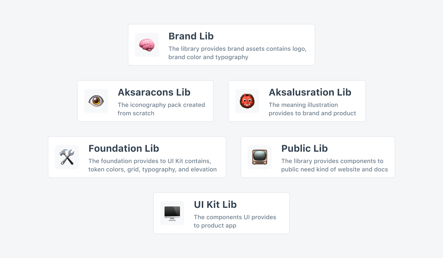
🧠 Brand Library
The library provides brand asset
- Logo
- Grid
- Color Pallete
- Typography
👹 Aksalustration Library
The meaning icon provides marketing and product
- 3 type illustration
- Lasting impression figure
📺 Public Library
The library provides components to public needs.
- Website and docs components
👁️ Aksaracons Library
The iconography pack was created from scratch
- 500 unique icons
🛠️ Foundation Library
The foundation provides to UI Kit library
- Color token
- Grid
- Typography
- Elevations
🖥️ UI Kit Library
The component UI provides to the product app
- Atom and molecules components
- 42 web components
- Support small and large screen
Collaboration Playground
We are a small team with enormous talent. We don't have a dedicated team to focus on crafting the Aksara Design System. But we believe the constraint makes us more creative. Therefore we decided to adopt the contribution model, which is that the Aksara Design System should have a PIC on the designer and a PIC on the engineer. The PIC design handling is all about design and experience, and the engineer PIC handling is about tech and component stability.
Contribution model
Collaboration is the key when crafting the design system. But, the contribution is more essential to make our design system useful. When the contributors are passive, the Aksara Design System is stuck and not scalable because the design system is made for itself. The big challenge is how to enable the designer and the engineer to be more active. We have to try a few solutions every week. We have a ritual called Aksara Checkpoint, and we spend time talking about the Aksara Design System, sharing knowledge, updating, and the design system as global.
Documentation
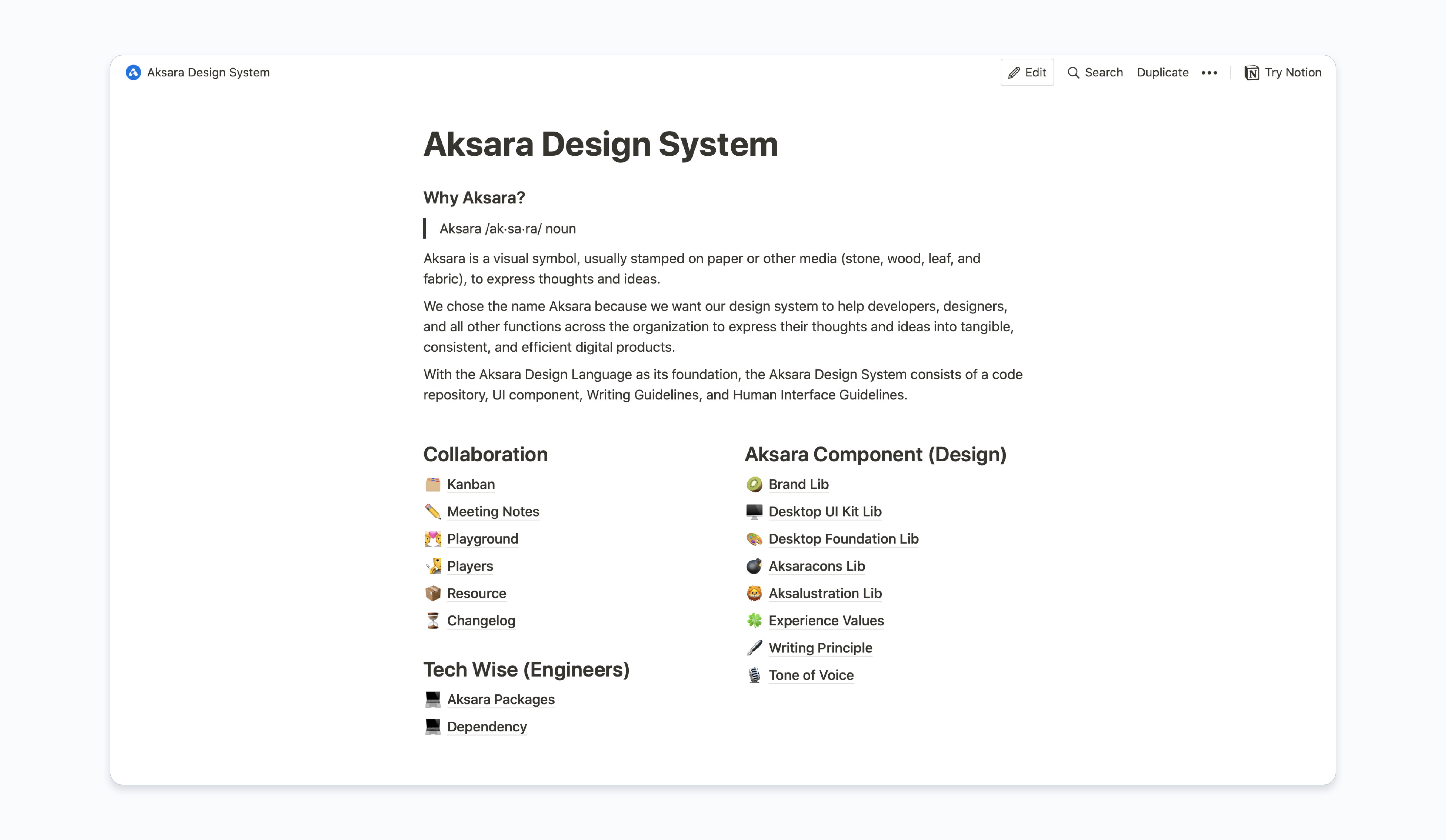 Also, we believe everything will be eternal if written. Therefore we create living documentation on the notion to accommodate everything. For example, we have a playground room to accommodate the designer's and engineers' thoughts or feedback. Whether the contribution is small or not, It's essential to make our design system valuable and useful for everyone. As well as create proper documentation in every component containing the variant components, the usage, the accessibility, the keyboard support, the best practice, and the content guidelines and the component.
Distribute The Components
The process of crafting a design system is important, but distributing a design system is the same important too. We should think about how our design system can be useful; the designer and the engineer can easily use it. How does the designer use it? It is the same as the engineer implemented. The answer is to create a version of the design and the code repository. It's crucial to keep our workflow on the same page.
The Contributor and User
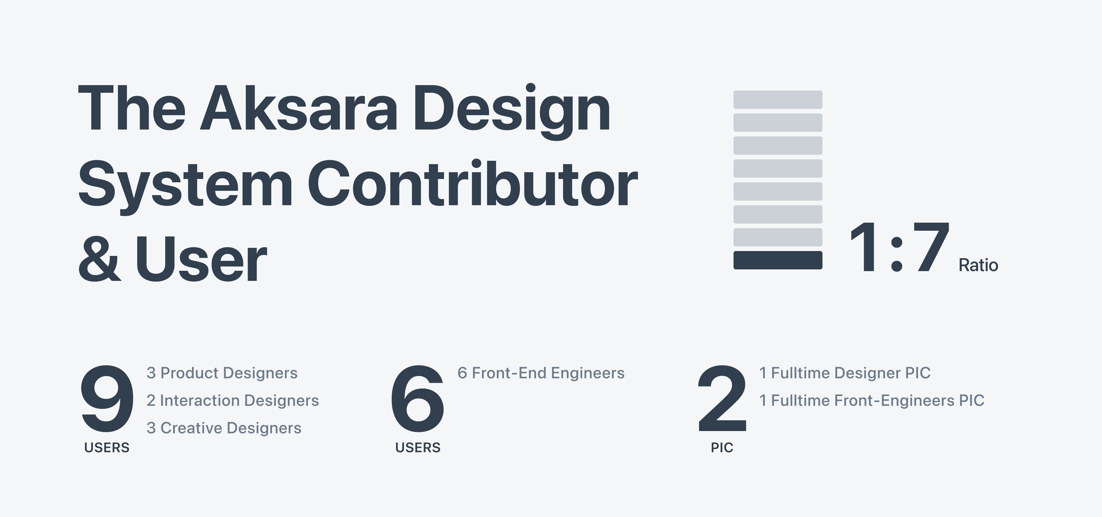
Our workflow culture is a contribution model in which the designers and the engineers even the PMs have the privilege to contribute anything when using the Aksara Design System. As a result, we have a ratio of 1:7 on Aksara System contribution dan users, which has a 2 PIC for designers and engineers, 9 users for designers, and 6 users for engineers.
The Impact
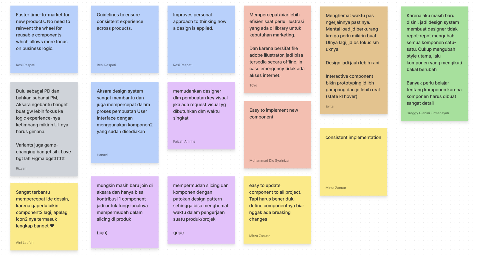
The Aksara Design System is impacted by faster time-to-market for new products. There is no need to reinvent the wheel for reusable components, which allows more focus on business logic-the Design System Guide to ensure a consistent experience across products.
Summary
- The design system is not about a visual, but how to create a culture workflow between the designer and engineers, and other teams involved.
- The design system came from the team issue and then used themselves too. So, every design system has a different approach.
- The big challenge when crafting a design system is how to enable contributors to contribute. Whether their contribution is small or not, it is important to make the design system useful, valuable, and scalable.
Proud of the Aksara Design System team who have made our dreams come true. We build a common language workflow culture and empower people with design systems. Thank you, Mas Tri, for making the Aksara Design System version 01. Mas Adry for the legacy of the Aksara Design System version 02. Mas Rizyan for providing copy and content guidelines. Also, Evita, Aini, Greggy, Hanavi, Gamal, Toyo, and Faizah helped me maintain and contribute.
Lastly, to the Engineers, Resi Respati, who created the core and foundation of the Aksara Design System, versions 01 & 02, to Mirza Zanuar, who translated our visual components into actual code implementations, Fahmi, Jojo, Dio, Izzan, and Evan for the contributions.
| Preview | Hex | Token |
| ------- | -------- | ----------------------------- |
| #00880D | 00880D | fill/brand_green/primary |
| #E0FFE0 | E0FFE0 | fill/brand_green/secondary |